[Previous Post: Why you should get professional property photos
Table of Contents

Brief Kitchen History
The earliest "civilised" kitchens were often located in a separate room at the rear of the house.- There were open fires, food hung from massive rafters and cooking utensils consisted of clay pots and stoneware.
- For the wealthy and upper-class, kitchens were dirty places to stay away from.

1906 kitchen - By the early 1900s, gas cooking and electricity was invented, and clean water had became prevalent.
- It was also the first time people were introduced to refrigerators, boilers and ovens.
- With the industrial revolution and introduction of production line into factories, efficiency became sought after in working environments, the kitchen included.
The introduction of gas, water, and electricity to homes in the 19th and early-20th century changed the way Edwardian people lived and cooked.
|
| ||||
|
|
Water
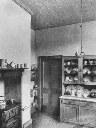 |
| Interior view of a kitchen in 1906 |
The widespread installation of running water in the 19th century provided a huge boon to kitchens, because now sinks became a focal point of the kitchen.
Large enough to carry out all manner of water-related activities, the kitchen sink was huge, heavy and almost immovable, giving rise to the colloquial phrase ‘everything but the kitchen sink’.
Gas
Gas pipes provided both light and heat in the house (as well as the occasional explosion or fire), making cooking an easier task and allowing ovens to become smaller and lighter.Brick-and-mortar stoves fired with coal remained the norm until well into the second half of the nineteenth century.
- Pots and kitchenware were typically stored on open shelves, and parts of the room could be separated from the rest using simple curtains.new stoves with their smoke outlet no longer required a high ceiling in the kitchen.
- The kitchen floors were tiled; kitchenware was neatly stored in cupboards to protect them from dust and steam.
- A large table served as a workbench; there were at least as many chairs as there were servants, for the table in the kitchen also doubled as the eating place for the servants.
Electricity
When electricity was adopted in some pioneering Australian towns, it made kitchen life increasingly more comfortable and stimulated the invention of time-saving kitchen appliances over the coming decades. In fact, the first electric cooking stove, otherwise known as the Kalgoorlie Stove, was patented by West Australian resident and municipal engineer David Curle Smith in 1905.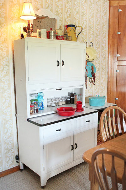 |
| The Hoosier cabinet |
Interior view of a kitchen in 1906; photo appeared in Beautiful Homes, Wunderlich, Sydney 1906, p.29; photo by Wikimedia Commons user SLQbot courtesy of John Oxley Library, State Library of Queensland
Julie Ranee Photography
Storage and bench space
A greater interest in how to increase efficiency and promote time-saving methods in factory production (think the Ford Model T motor car and invention of the factory assembly line) flowed into kitchen design as well.Early kitchens had very little bench space or storage because kitchen cabinets (built-in or otherwise) were not yet in production for the home.
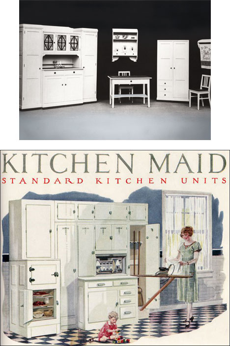
In 1899, the Hoosier Manufacturing Company (USA) adapted the existing baker’s cabinet into the freestanding metal Hoosier Cabinet. It had space-saving and functional features like upper and lower cabinetry, shelving, a flour bin/sifter and pull-out work surface. The Hoosier cabinet was compact yet large enough to provide adequate storage and make working in the kitchen that much more efficient.
Early Kitchen Cabinetry
In Australia, the Hoosier (or one of its variations) soon became a kitchen staple, described in 1918 in The Farmer and Settler as the “principal item of kitchen furniture”, along with the cooking stove.Other features of kitchen design recommended in The Farmer and Settler included:
- White tiled-walls to keep the kitchen “clean, cool, and comfortable”
- A “Wedgewood blue” wash above the tiles and patterned linoleum floor to match
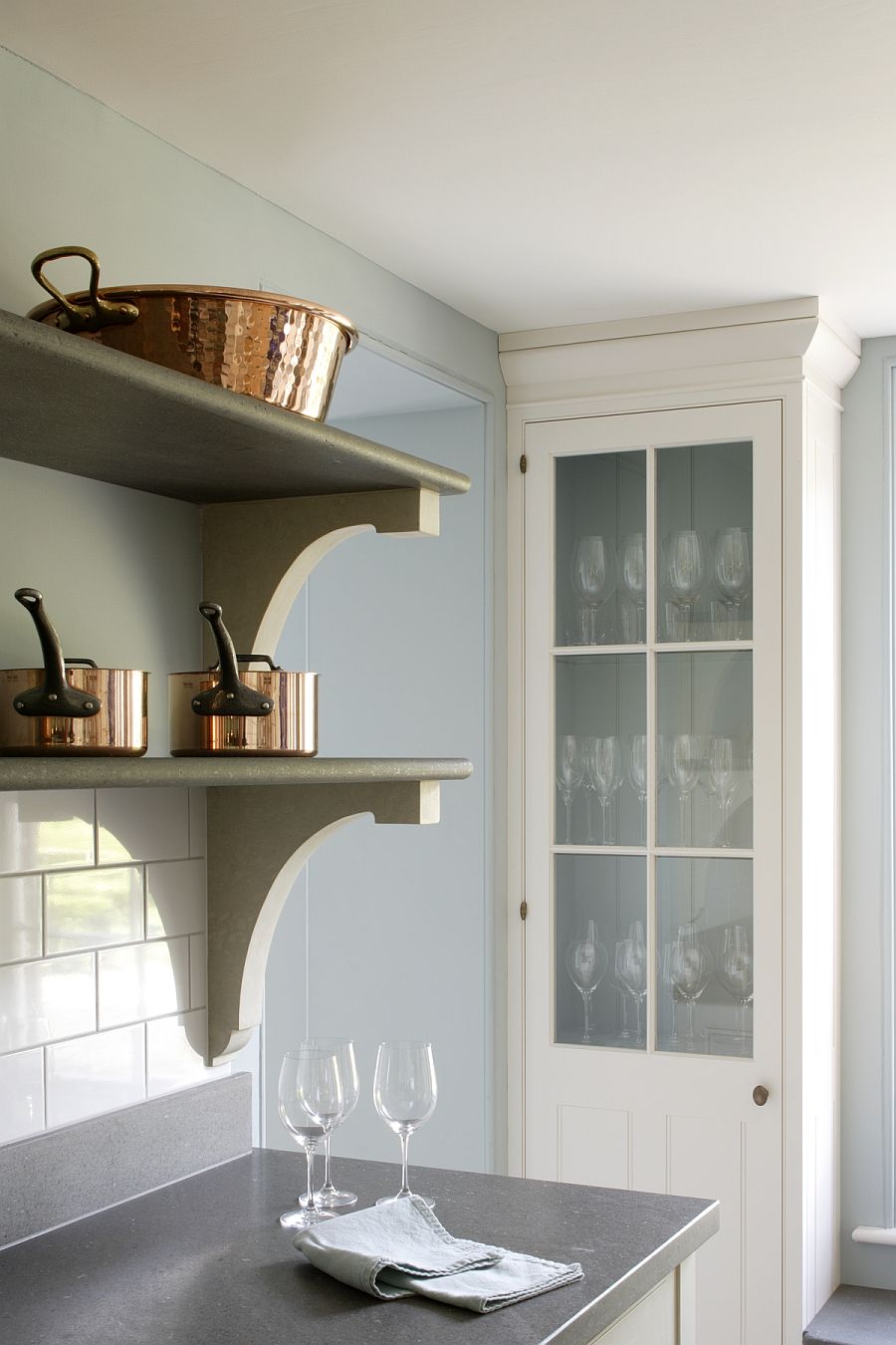
- A rack to display saucepans that if “well chosen and carefully treated, add considerable attractiveness to a kitchen”
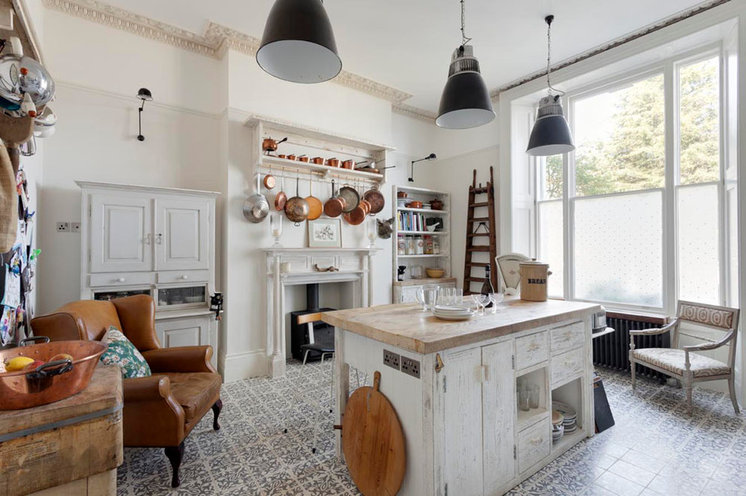
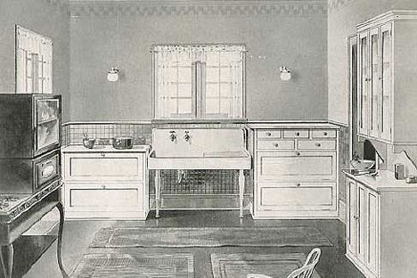
Kitchen design with Hoosier style cabinet at left
The Edwardian Kitchen
Posted on July 9, 2011 / Posted in home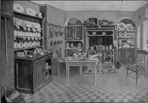 |
| Ideal Kitchen |
- Convenience of distribution in its parts, with largeness of dimension
- Excellence of light, height, and ventilation
- Easy of access, without passing through the house
- Walls and location so arranged that the odours of cookery cannot spread about the house (the Victorians and Edwardians had a phobia of kitchen smells!)
- Plenty of fuel and water, which, with the scullery, pantry and storeroom, should be so near the kitchen as to offer the smallest possible trouble in reaching them.
The issue of sanitation was also one of importance, and it was advised that walls be made of white glazed tiles and floor coverings of oil-cloth and linoleum.
- However, this varied depending on the architecture of area–for example, flags of smooth stone were cemented together to form a smooth floor in the north of England, the kitchen floor usually consisted of unglazed red tiles in the Midlands, and on the east coast, floors were frequently laid with red or yellow bricks.
- Kitchen fixtures were simple and utilitarian, and a well-constructed sink of either wood lined with zinc, stoneware, or lined with cemented tiles were recommended.
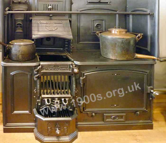 |
| Old Victorian or Edwardian coal-fired kitchen range, also known as a kitchener. |
A large work table was the most important article of furniture, and the drawers at each end contained the cook’s tools, such as knives and spoons, and small utensils and implements in constant use.
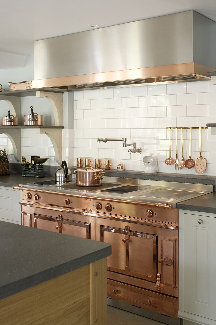
The last, but by far the most important of the kitchen requisites was the kitchen range, or kitchener, which was used for cooking, heating water, and so on.
- The kitchen range was a range, either open or closed, that was fixed in its place with brickwork,
- the kitchener was a range entirely independent of its surroundings and stood on four legs,
- the gas range or stove was similar to the kitchener, but was, of course, run with gas.
- Oil stoves and cooking by electricity were also popular options, though the latter was incredibly expensive to run.
|
|  |
Kitchen Utensils
A kitchen in tip-top form always contained a full array of utensils.
- There were the stewpans and saucepans of tin, copper, brass, enameled iron, and wrought steel; the boiler for boiling large joints, hams, and puddings; the digester, a small stock pot; the stock pot itself; the braising pan; the double or milk saucepan (a small bain-marie); steamers; fish-kettles; fish fryers; the frying pan; the bain-marie; the dripping pan; the gridion; and the dutch oven.
- Other must-have utentils were weights and scales, a mincing machine, steak tongs, knives, a colander, a pestle and mortar, a chopping board and bowl, preserving pans, sieves, coffee and pepper mills, baking dishes, tartlet pans, vegetable cutters, an egg poacher, freezing machines, water filters, refrigerators, etc.
'Modern' Kitchen Cabinetry
From Core77In 1892, a 33-year-old cabinet maker named Friedemir Poggenpohl opened his own workshop and an adjoining furniture store in Bielefeld, Germany, focusing on kitchen cabinetry. Uniquely, he produced kitchen cabinets not only in wood, but in a white lacquered finish.
 |
|
- In 1928, one year before Austrian architect Margarete Schütte-Lihotzky essentially invented the galley kitchen, Poggenpohl's company introduced the "Reform Kitchen," seen above.
- It's not yet a complete kitchen like Lihotzky's (galley) Frankfurt Kitchen, but the interconnected cabinet modules, polished white lacquer and Modernist aesthetic were eerily prescient.
Two years later Poggenpohl refined their lacquering technique into what they branded "Zehner-Schleiflack" (literally translated, "ten varnish"), which used ten processes to lay down an unparalleled surface quality.
- It was 1930 and Poggenpohl was probably producing the finest kitchen surfaces in the world. Prior to this, kitchen surfaces were predominantly wood, which of course aged and grew stained over time. Poggenpohl's innovation of this era turned the kitchen into a place of visual cleanliness, making it look more like a hospital rather than a workshop.
Arts and Crafts kitchens
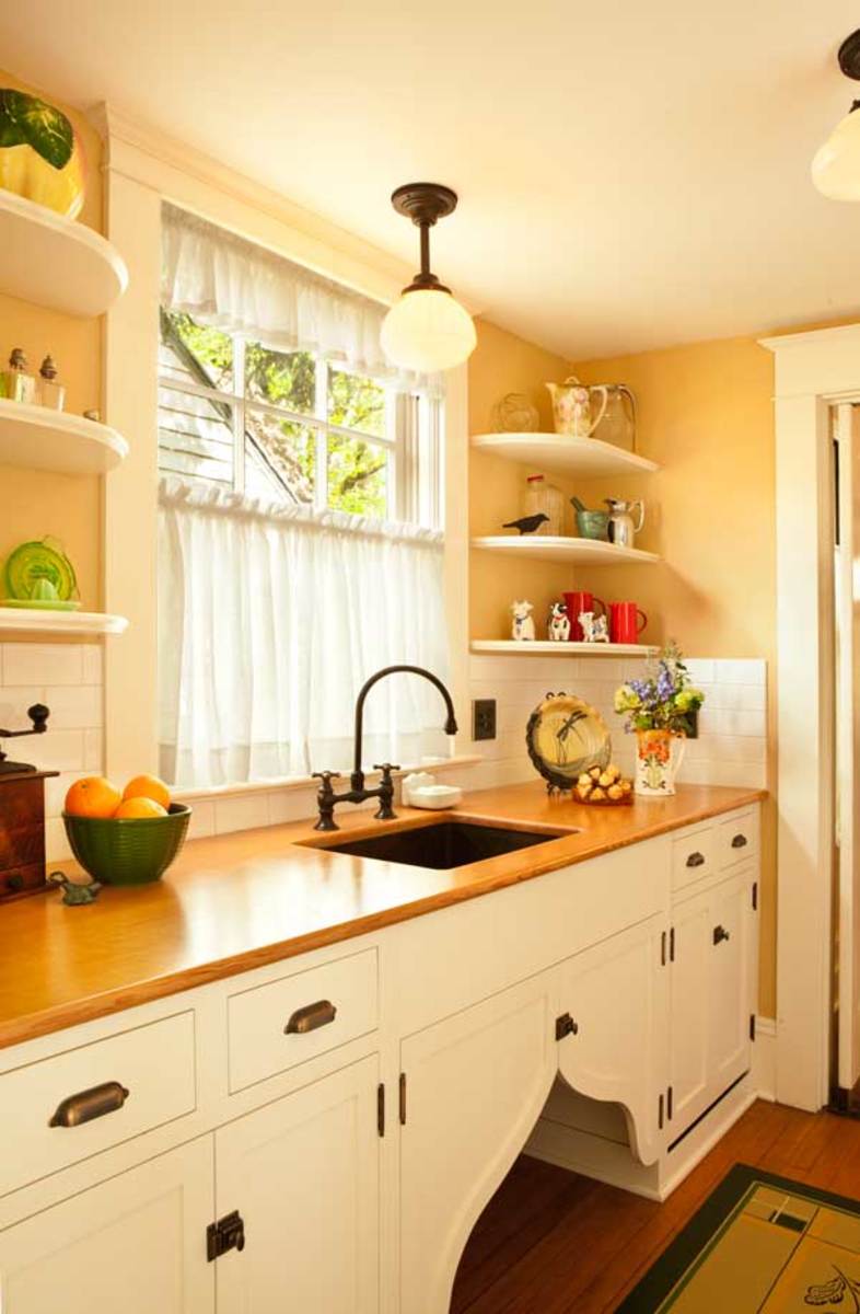
Arts and Crafts Kitchens are identified by simple lines, rugged construction, and very little excess ornamentation.
- The style is often associated with American styles: Mission, Shaker, and Craftsman designs, although there are some historical differences between them.
 |
| Arts and Crafts Style Kitchen |
This Arts and Crafts style kitchen features traditional cabinets in quartersawn white oak, white countertops, craftsman green accents on the walls and splashback and a sizable kitchen island with a large prep sink.
The Arts and Crafts movement began in England around 1890 in response to the overly ornate, assembly line furniture of the time. The movement focused on aesthetic simplicity, talented craftsmanship, and impeccable quality.
- Arts and Crafts kitchen design relies on straight lines and heavy proportion. It bears some resemblance to Gothic, Shaker, and Oriental designs.
- The American style often features Mission or Shaker door styles, iron or brass hardware, and Quartersawn Oak cabinets. Other appropriate woods include Ash, Birch, Cherry, Hickory, and Maple.
- Arts and Crafts cabinets, built properly, feature dovetailed drawer boxes, mortise and tenon joinery, and rugged hand-made construction. The ultimate goal is functional, well-built, and enduring cabinetry, built like an heirloom piece of Stickley furniture. Read more:
Revival Kitchens
from http://artsandcraftshomes.com/revival-kitchens/by PATRICIA POORE on AUGUST 27, 2013
 |
| A breakfast pavilion blends indoors and out in a new house |
Most bungalows, American Foursquares, and Tudor Revival houses had kitchens built for use by the housewife (not just servants). Kitchens may have been small but they were integrated into the main floor plan, and they had built-ins and electricity. Putting a sympathetic new kitchen into these houses is easier than remodeling a colonial or Victorian one.
 |
| Craftsman design is an evolving vocabulary |
Revival kitchens reflect the changing role of the kitchen since the bungalow era. The kitchen is no longer a utility room, but the center of the house. It may have a second prep area, a wet bar, a home office, a breakfast area, and a television. Then and now, related rooms include a back hall or mudroom, a bathroom, and one or more pantries. If you are building a new home or extensively remodeling an old one, it makes sense to build a more public and finished kitchen.
 |
| Period-inspired new kitchen |
Common sense should prevail: why spring for professional appliances if you eat out five nights a week and use a microwave on the other two? On the other hand, if you’re always in the kitchen making a mess, don’t use fussy and hard-to-clean details and materials. That said, revival kitchens are often beautiful spaces with furniture-quality cabinets accented by art tile, handsome light fixtures, forged and cast hardware, and decorative textiles.
Suggestions, Not Rules
Over the years, kitchen designers and our editors have often repeated this advice to those planning a kitchen renovation or addition.• Keep it in scale! You don’t want it to look like an estate kitchen with a bungalow attached. Stay on the original footprint, perhaps borrowing space from a back hall or pantry. Additions should be proportionate to the house; sometimes just a few feet, bumped out on the rear or side of the house and with windows for extra light, is enough.
 |
| A new kitchen in a 1915 Prairie School house. |
• Simple is often better. First of all, the room will have a more timeless “period kitchen” look if details are borrowed from historic kitchens, or the pantry or hall—rather than copied from high-style details in the dining room. Second, a simple kitchen is easier to clean!
• Use several different counter surfaces.
That’s more historical than installing linear yards of matching laminate or granite—and it’s practical. Pick something nonporous near sink and stove, butcher-block for prep, perhaps a marble slab for baking or pizza making. You may even be able to save on remnant or salvaged material for small areas.
• To get a timeless room that doesn’t follow fads, don’t go all-white or all-black; do consider black and white plus color. (Black soapstone or granite with creamy painted cabinets is a winning combination.) Use some naturally finished wood for the floor, cabinets, or a piece of kitchen furniture. Add color with tiles, wall paint, a retro stove, or collectibles.
Putting Back a Period Kitchen
by DONNA PIZZI on JANUARY 15, 2013 in KITCHENS & BATHROOMShttp://artsandcraftshomes.com/putting-back-a-period-kitchen/
Right: The antique work table was rebuilt and enhanced with a shelf; the door to its left is a pass-through for milk bottles.
All photos by Blackstone Edge Studios
|
|
In the pantry, wood countertops surround a copper sink. A dishwasher is hidden behind false drawer fronts. The “flipper doors” under the sink add a period touch.
The Youngs were living in a smaller house back in 1986 when the house next door, a three-story Foursquare built in 1909, went on the market. The once-fine, six-bedroom home had become a rooming-house in the 1940s. When they toured it out of curiosity, Sig Young remembers thinking, “Glad it’s not ours—too much work!”
... “The back kitchen had been virtually untouched since the 1920s,” Jack says. It was one big room with no built-ins or cabinets and, oddly, a 6½’-long sink that blocked the basement door.
- A separate butler’s pantry had been the functioning kitchen since the 1970s.
- “We agonized over what to do for years,” says Jack.
- Meantime, they removed wallpaper in the dining room, revealing signs of the original built-ins.
- Jack, who is a talented woodworker, rebuilt them with wood countertops.
|
|
|
“When Matthew returned with drawings of the butler’s pantry that included glass-front cabinets and wooden counters like the ones I’d built for the dining room,” Jack remembers, “I said, ‘Wow!’”
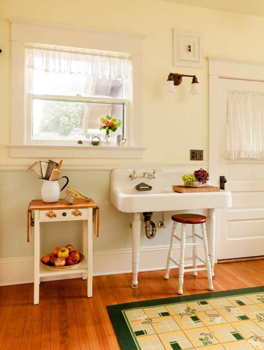
An old porcelain sink on legs, smaller than the huge one found in the kitchen, allows access to the door to the back porch.
For the back kitchen, Roman had designed a full wall of cabinets to hide a refrigerator and a pullout pantry. Jack had entertained just such an idea, but “I didn’t have a clue how to do it.” Roman’s drawings had sealed the deal.
Jack and one of his sons tackled the demolition work, carefully recycling elements for another kitchen in the basement. To bring the original electrical junction box up to code, it had to be accessible. Jack devised a door handle from vintage electrical knife switches, which are found in abundance at Old Portland Salvage. (The building inspector was awed: “That’s so cool!” he said.)
A remnant of colorful linoleum was uncovered at the bottom of the old dumbwaiter (which had brought stove wood up from the basement). Sig contacted Gracewood Design to see if the design could be re-created on a canvas floorcloth. “We’d seen their ad in Arts & Crafts Homes,” Sig says, “but we didn’t realize they were right here in Portland!” The finished product was dubbed ‘Signoleum,’ and when a derivative version was painted for the butler’s pantry, it was called ‘Signoleum, Too.’
 |
| This wall originally held a dumbwaiter and utility closet. |
This wall originally held a dumbwaiter and utility closet. Owner Jack Young built the library ladder from a kit; it allows access to the upper pantry cabinets.
Contractor Mike Edeen stripped the tall baseboards and repaired the plaster. He refinished fir floors found beneath layers of vinyl and enhanced the room’s trim. Then he built the period-inspired cabinets.
“Mike is such a skilled craftsman,” says Karla Pearlstein, “that he can take Matthew’s drawings and articulate the subtleties.” Sig and Jack say they couldn’t be happier with how it all turned out.
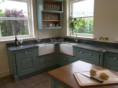
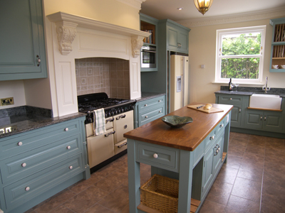
Edwardian Style Kitchen Redesign
 |  |
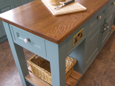 | 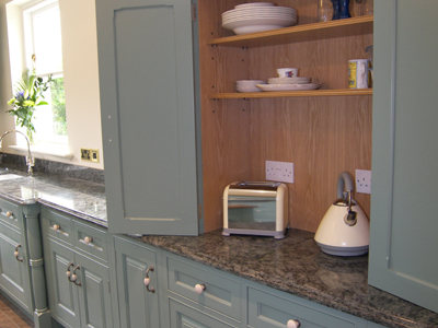 |
|
| ||||
 |  |
A Classic Kitchen for an Edwardian Renovation
The homeowner-architect designed his new kitchen in an eclectic British Edwardian style, inspired by the work of Voysey and other designers of the period. By Patricia Poore | Photos by John GroveFrom Old house Online
|  Sources
| ||
|  |
- With an empty nest, they decided to absorb two former bedrooms into a larger kitchen—without changing the footprint.
- The 50-year-old house sat on a narrow lot in Piedmont, California; buying the adjacent lot allowed them to plan outdoor space at the rear.
- Now the breakfast room opens to a lawn and garden. The new kitchen is generous—over 10′ x 16′, and filled with light.
In renovating the house, Malick leaned toward an eclectic British Edwardian style, and the kitchen is in the same vein.
- The work of C.F.A. Voysey and other designers of the period inspired moldings and the gently arched openings.
- The layout, which is balanced but not strictly symmetrical, is organized around a central island.
- The green-painted cabinets and stile-and-rail paneling that covers wall surfaces plays against the lawn and hedges seen through windows on three sides of the room.
- “I get a lot of inquiries about the paint color,” Malick says. “The green was custom-mixed on site; its depth makes it highly responsive to light.” In neutral light, he says, it’s a subtle mint color; indoor lighting warms it. The room is further brightened by light reflected off the Calacatta marble used for countertops, steps, and stove hood. Underfoot, concrete floor tiles cast from an antique arabesque pattern add movement.
Each window is framed by casework that extends to the countertop.
- Recessed down lights are concealed behind arches, both over the sink and highlighting clerestory windows above cabinets.
- In a shallow nook just outside the busy work triangle, a built-in desk overlooks the garden, flanked by shelves for cookbooks.
- A large opening next to the desk connects the kitchen to the breakfast and family room.
References
- A Brief History of Kitchen Design, Part 2: Gas & Water, BY RAIN NOE - JUN 30, 2011
- A Brief History of Kitchens, Posted on Thu, November 14, 2013
- Recipe for Success: A History of the Modern Australian Kitchen
How the kitchen has evolved from the Cinderella room of the house to be the hub of contemporary home life, by Rebecca Gross - Gorgeous Bespoke Kitchen Combines Modern Luxury with Edwardian Charm
- Edwardian Style Kitchen by Matthew James Kitchens
- A Classic Kitchen for an Edwardian Renovation at oldhouseonline.com
- A Brief History of the Kitchen - Changes in kitchen design often reflected economic and societal changes.written by Anne Reagan, January 27, 2015










I liked it so much and very interesting, too! Thanks for sharing the experience.
ReplyDeletehttps://xuongnoithathoanggia.vn/xuong-san-xuat/xuong-san-xuat-tu-bep-go-acrylic-tai-ha-noi-uy-tin/
https://xuongnoithathoanggia.vn/xuong-san-xuat/xuong-san-xuat-sofa-tan-co-dien-tai-ha-noi-uy-tin-chuyen-nghiep/
https://xuongnoithathoanggia.vn/xuong-san-xuat/dia-chi-thi-cong-noi-that-biet-thu-cao-cap-uy-tin/
Thanks for posting your blog. Your content is realy informative for us......
ReplyDeleteBuddha Paintings
Warli Paintings
Horse Paintings
Girl Paintings
Rose Paintings
Transform your home with style and functionality by choosing expert Designer Kitchens Sydney services.
ReplyDelete